October 8, 2014 - 19:14

Amelia Brady-Cole
Disability, Identity, Culture
Kristin Lindgren
October 8, 2014


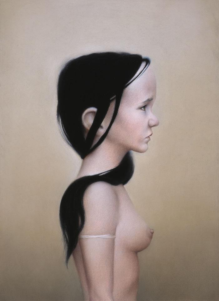
At first glace, the first portrait, titled Lu II, appears to be of a young woman. Othered and alone, she radiates much of the archetypical teenage experience. Upon looking closer, however, it’s clear she’s not as simple as a sullen teenage girl staring off blankly into the distance. I realized that I was seeing two distinctive kinds of features. Those of a woman and those of a child. When looking at her breast and the side of her abdomen, it looks like the body of a physically mature woman. I used a tool Riva gave us with her self-portrait to look at these connected yet opposing features. I separated the subject’s head and neck from the rest of her body for a few minutes. There’s a kind of power in the way she’s standing so still. Disregarding her face for a moment, her stance alone conveys a certain stoicism and autonomy, but not in the way that’s usually expected of female models. She’s using her sexuality and physical maturity not to lure and tease, but to say, with her pose, that the viewer means nothing to her. Her body displays a femininity and stillness that’s small but full of power and intention. The armband she wears is even reminiscent of a priestess or a warrior. It’s small and thin and unassuming, and yet it seems to symbolize the strength and honor that she possesses.
Similarly to the stillness of her body, her head and neck seem to be planted firmly in place. Her eyes, staring slightly upward, are purposeful in their direction and poise. Though the light shines from the direction of the viewer, she’s not distracted in the slightest. The more I stare at her, the more I want her to turn to face me. I want her eyes to land on me in that purposeful way. The longer I wait, the clearer it becomes to me that this feeling is what the artist wanted to evoke in his viewer. She has no interest in engaging with people who want to stare. Her power is held in her refusal to reveal the rest of her face. I so badly want to see the rest of her face, but she exposes only half of herself, keeping the rest a secret.
Stepping back for a moment, I try to revisit her face the way I saw it the first time I saw looked at this portrait. I cover her body, and look only at her head, face, and neck. All of a sudden, that power is taken away. Her upward stare turns to childish timidity. Instead of taking a stance and asserting her power and adulthood, now she’s pouting and powerless. Her jawline is weak and blends softly into her neck like the facial structure of a young girl. Her large and rounded head looks almost infantile. Her ear, large and protruding evokes feelings I have toward toddlers. Even her eyebrow could communicate worry and confusion. Suddenly I feel she’s cute and must be taken care of. My desire to have her turn to me becomes a condescending one. I want to reason with her, as though she has no ability to truly understand or deny me.
To then look at the full portrait, the juxtaposition of these two seemingly conflicting ages captured in one subject, makes me feel uncomfortable for looking at her as a sexual being. She's clearly confident in her exposure, but her expression gives us a glimpse of something more complex. Her pose is now reminiscent of a mug shot without name or identification number. It's almost as if she's aware she's done something wrong by allowing herself to be seen as sexual. The blame is then taken away from the viewer and put on the subject. As part of a larger collection of portraits of people with physical and developmental disabilities, exploring this person’s physical representation of age and ability gives us a window into the complexities surrounding autonomy and respect. So often we lump developmental disability with developmental immaturity. Often disabled people are seen as equal to children. I found myself putting this on the subject, and becoming more aware of how we often view different kinds of people.
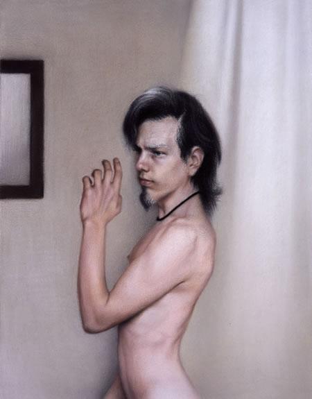
Moving on to Mirror, the pose Rush chose for this particular portrait in comparison to Lu II, is also gendered. The way this subject is able to assert his power is not through feminine stoic stillness, but through distinctively masculine action. His pose, unlike Lu’s would not be maintained for a long period of time. It’s clearly meant to capture movement and to communicate change. The way he holds his hand is reminiscent of an ancient ruler or king. I stood how he stands for a while to try to understand what it is he might be doing. I found myself wanting others to pause while I continued to think or speak. He’s commanding the room in what seems to be an incredibly gendered way. He doesn’t have to raise his voice or wave his arms to get the attention and respect he seeks. All he needs to do is make a subtle gesture that indicates his discerning strength. He’s not raising his hand to ask permission to speak. He’s announcing his presence and taking space and attention. His hair, peppered and long asserts his age and distinction. His facial hair especially connotes power and masculinity. While there’s slightly more of his environment included in the frame than in Lu’s, the focus is still completely on him. This light even shines in the same way as it does on Lu, but in this portrait he seems to reflect the light and make it part of himself. It seems to me that Lu’s light is separate from her, while he bathes and revels in his.
The title of this portrait is Mirror. After thinking about this for a while, I’m realizing that this portrait could be interpreted in a completely different way. If we assume there’s no one else in the room and he’s standing in front of the mirror by himself, his pose takes on a completely new meaning. He could be practicing his power stance or pretending to be taking control of a room. If he’s looking in the mirror, maybe the whole projection of confidence is a feigned attempt at looking more masculine and commanding than he normally feels.
The concept of age as a marker of ability then comes back into play. Unlike Lu, this subject’s age may symbolize competence and power, and yet for some reason he doesn’t feel that assumed power and so he has to work toward claiming it for himself. Though physical and sexual maturity tend to define both men and women, the contrast between how that definition is created in both of these portraits is indicative of the way our society genders sex, power, and autonomy. The startling effect Lu’s nudity has on the viewer stems from a place of female sexual repression. The first thing I noticed about her was that she was naked. Her breast is exposed, and immediately my mind went to sexuality and how she’s using her body to define herself as a sexual being. However, for Mirror, my first reaction was not to his nudity, but to his pose. His body was not inherently sexual, and I assumed that he was in control of his own physical representation and conduct. Why is it that the absence of clothing infers docility and defeat in women, but power and authority in men?
The difference in their stares is fraught with gendered tension. Hers, slightly upward, toward something or someone above her, acknowledges her lower status and her lack of power. His, slightly downward and glaring, drips with authority and power. If this difference was an intentional one made by Rush, I wonder if it’s a commentary on gender inequality. If it was unintentional, there are endless reasons why it’s problematic. Even the quality of the brush strokes and intensity of shadows are sharper and more defined in Mirror than the soft and blended strokes in Lu II. Though their relative size to their portraits in their entirely are similar, Lu seems to shrink away and blend into the background in a way that would be harder for him to do. He uses his defined musculature in cooperation with the light to highlight his edges and define himself in the space. It’s almost like he’s captured the light of his own accord and manipulated it to emphasize his strength. Her light falls on her softly and washes her out, draining her by exposing her body in a way that isn’t in her control.
Even with all of this difference, the similarity of the two portraits is striking. The background in Lu II is slightly warmer, and there are more shadows in Mirror, but the composition, angle, and focus are much alike. Even the light is used in the same way to illuminate his subjects. I see references to the different ways men and women utilize power and autonomy. I also see how Rush is attempting to portray them in a wholly human way. There isn’t any kind of objectification in these portraits that I can see, unless it is assumed that in sexualizing a person, you inherently objectify them as well. I can only assume that Rush was using this similarity to bring focus to the subtle differences he sees in his subjects.
Though these two portraits are part of a much larger collection of people with disabilities, without background knowledge of their own personal disabilities, it’s hard to interpret meaning beyond what’s plainly in sight in Lu II and Mirror. When I first sought more information on Rush’s work, specifically these two portraits, I was disappointed when the information I could find was minimal. However, I realize now that an exclusion of outside knowledge may have been very intentional on the part of the artist. By showing us these two people, and not telling, the viewer is able to gather their own information and create their own understanding of who these people are. That may be the very reason for this exhibition. When we see strangers with visible disabilities, we don’t get any background information. We’re left to create our own perceptions. The removal of these two people form any background information is, I see now, a way to humanize them.
